Accessibility in Tableau
Tableau 10.2 introduced new accessibility features to ensure that content created therein can adhere with Web Content Accessibility Guidelines (WCAG) and be accessible to as many individuals as possible. There are three levels of WCAG accessibility: A, AA, AAA. These levels are determined by the four main principles of accessibility determining if a content provider is: Perceivable, Operable, Understandable, and Robust. Most web-based content adheres to either A or AA guidelines (More on accessibility can be found here: Accessibility: Tools & Resources).
These four guiding principles of accessibility can be applied in Tableau in some of the following manners:
Perceivablility ensures that information and interface components must be presented to users in a manner in which they can discern.
- All non-text content must have a textual equivalent that serves the same purpose.
- Color (or another distinguishing visible element) must not be the only means of conveying information.
- All text and images of text must have sufficient contrast between the text foreground and background.
This principle is the most critical for Tableau Dashboards as it is the principle that most assists individuals with visual disabilities.
Operability ensures that user interface components and navigation elements are able to be utilized by all users.
- Dashboards should be operable with the keyboard.
- Labels of any interactive elements (visualizations, filters, legends) must have titles that are sufficiently clear and self-explanatory.
Understandability ensures that the information presented as well as the operation of the user interface is both coherent and unambiguous.
- Dashboards must include instructions for interactivity along with descriptive text that explains the information displayed on the dashboard.
Robustness ensures that content can be interpreted reliably by a wide variety of users and user agents, including assistive technologies.
- Dashboards must support interoperability with assistive technologies such as screen-reading software.
Additional information on building accessible dashboards and keyboard access is provided by Tableau here: Build Data Views for Accessibility, Keyboard Access for Embedded Views.
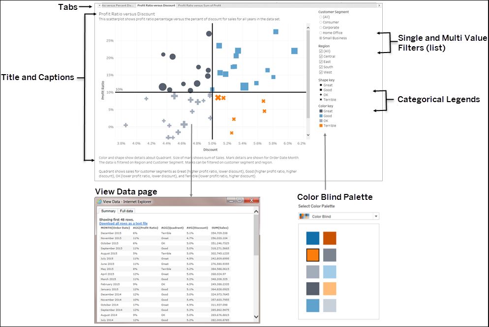
Color choices, input choices, positioning of content, and textual descriptions all need consideration when building an accessible viz. To meet accessibility standards, you can create vizzes that include the specific controls shown in the example below.
In addition to the controls shown above, Tableau also supports the following features to help you create accessible views:
- Keyboard navigation
- Programmatic context for assistive technologies (using ARIA roles)
- Text equivalents for charts and other visualizations
- Ability to conform to contrast standards
- Authentication when signing into the Tableau Server for embedded views
There are also some general guidelines that, when adhered to, allow for increased accessibility.
Simple Visuals
- Don't over-pack your view. Dense views can be difficult to understand or navigate using a screen reader or a keyboard.
- Aggregate your data whenever possible to help reduce the number of marks shown. Showing over 1000 marks can cause the view to be rendered via server as opposed to the browser; server-rendered views are not yet supported for WCAG conformance.
- Consider using simple graphical elements. Bar charts and line charts that allow for the use of text, color, and shapes can add additional context to the view.
- Limit the number of marks to those that emphasize the most important data points.
Titles and Captions
- Think about your views as a supplement to the text used to describe it.
- Use text in titles and captions to describe your visualizations and what you are showing.
- Use easy to understand language. Avoid jargon, unexplained acronyms, or obscure abbreviations.
- Phrases like "image of" or "picture of" in text descriptions are unnecessary, as screen readers often already include this information.
- Avoid using all capital letters for headings or titles.
Additional Text
- Use text in headings for legends and filters to describe the control and what it does.
- Use text zones on a dashboard to add additional context for visualizations.
- Refer to controls by label whenever possible (e.g. changing the label for a legend from Subcategory to Color key for product type). This can help users understand the relationship between the controls and the data.
- If you include link text in your view, use text that describes when the link leads (e.g. use link text "Global Warming Statistics 1990-2018" as oppose to "More information").
- Consider using Natural Language Generation (NLG) tools such as Wordsmith from Automated Insights, Narratives for Tableau from NarrativeScience, or Savvy from Yseop. These tools help produce data-driven textual narratives for visualizations.
Color and Contrast
- Use Tableau's color-blind palette in selecting appropriate colors for your view. Try to provide enough contrast and assign colors that differ from each other on the light-dark spectrum.
- Use additional options like shape or size to differentiate line marks, as well as labeling them to make them more easily distinguished.
- Use contrast analyzer tools to help select the best text colors and backgrounds with sufficient contrast ratios. Make sure that color contrast for text meets the contrast ratio standards of 4.5:1 for standard text, and 3:1 for larger text.
More Resources
Author Views for Accessibility
Best Practices for Designing Accessible Views
TC17 - Authoring for Accessibility (Video)
Think Data Thursday: Designing Tableau Dashboards for Accessibility (Video)
Referenced from: Tableau